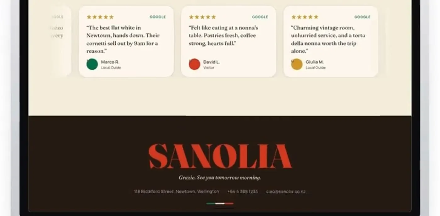
Sanolia
A booking-led site for a café, built around the room it belongs to.
Warm editorial type, a reservations flow built into the hero, and a review wall that carries the tone of the room rather than flattening it into stars.
The wordmark had to survive being the first thing on a phone screen at arm’s length, so the whole page was set from that constraint outwards.
- What was made
- Art direction
- Web design
- Front-end build
- Motion
- Built with
- Astro
- Cloudflare Workers
What it does
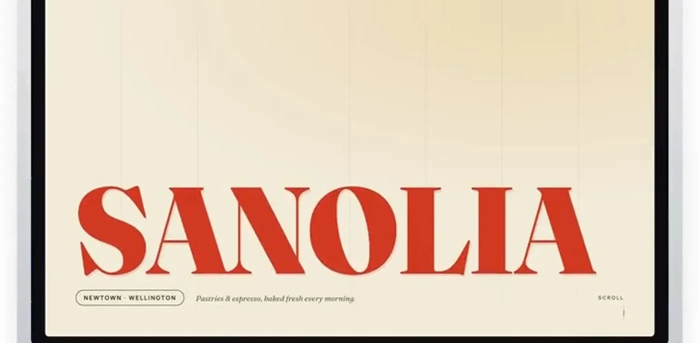
A wordmark sized for a phone at arm’s length
The name fills the first screen and nothing competes with it. Under it, one line saying where and what — Newtown, Wellington; pastries and espresso, baked fresh every morning. The whole page is set outwards from that constraint.
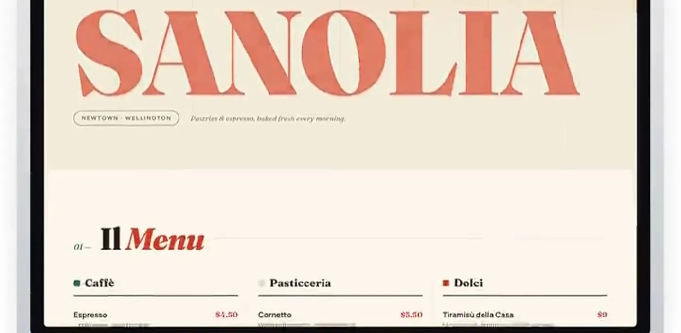
A menu that reads like a menu
Caffè, Pasticceria, Dolci in three columns, each item with its description and price on one line. It is the printed menu’s logic, not a web accordion — a customer scans it the way they would at the counter.
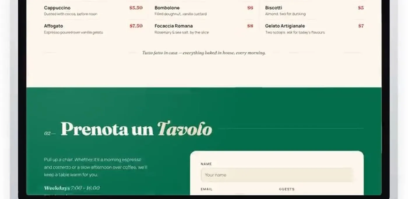
Reservations built into the page, not linked away
The booking form sits directly under the menu on a green field, with the hours beside it. Someone who has just read what they want does not have to go looking for how to sit down.
Reviews kept in the room’s own voice
Real-shaped review cards with names and sources, set in the café’s type rather than a plugin’s. They carry the tone of the place instead of flattening it into a star average.