Mauri
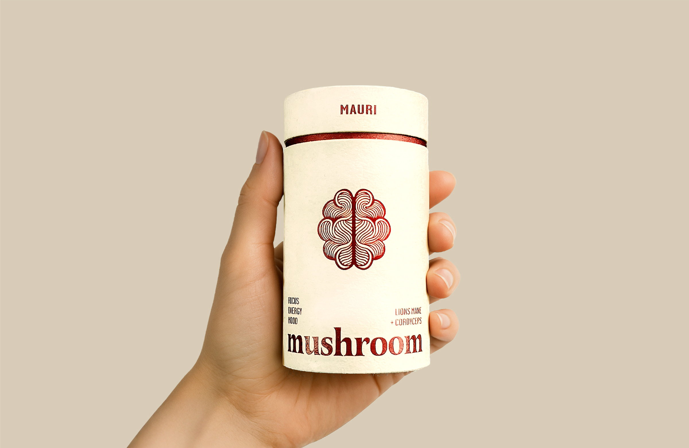
A supplement brand that had to work on a shelf, in a hand and on a screen.
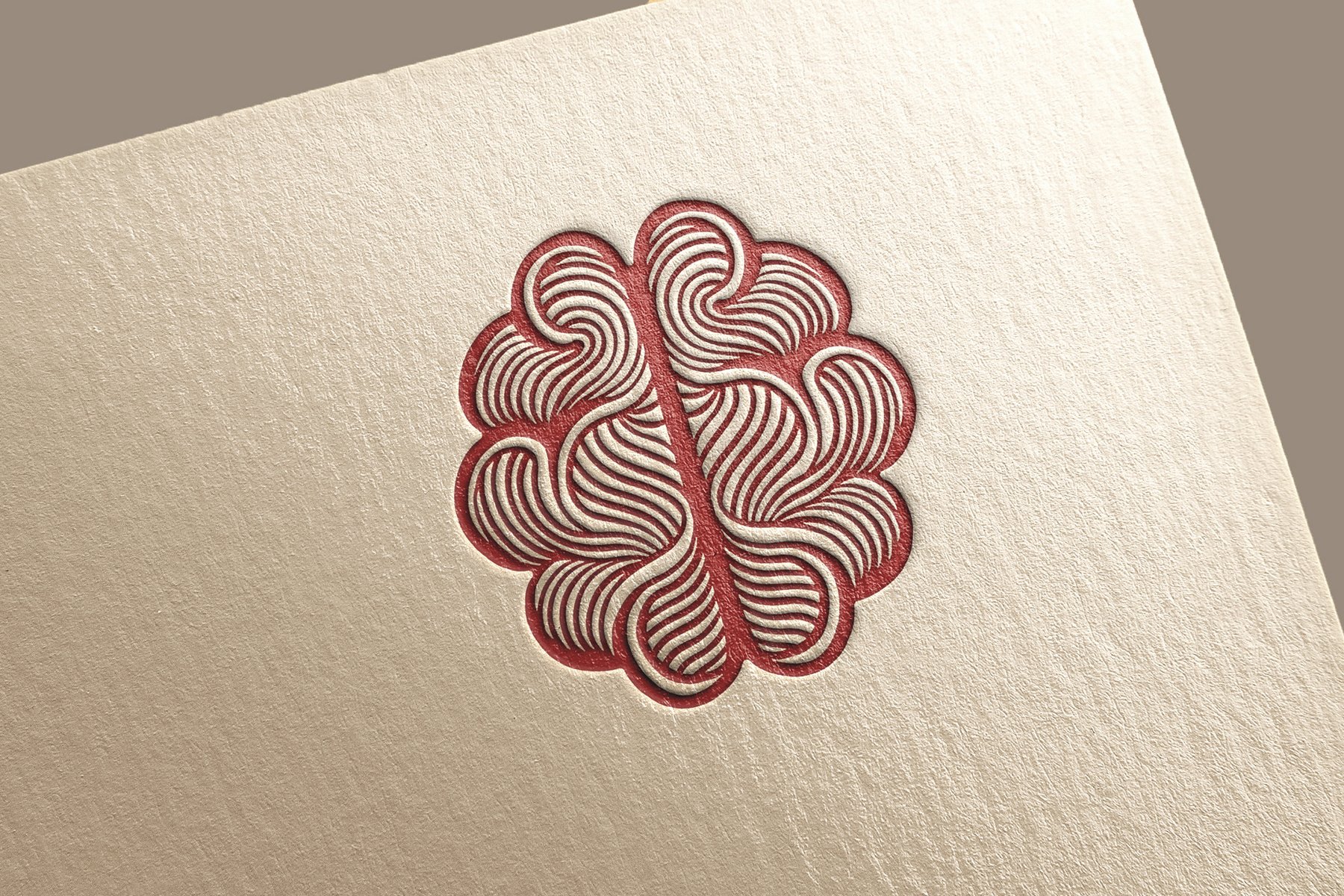
One mark, one palette and one type system, resolved on press first so the printed tube sets the standard everything else follows.
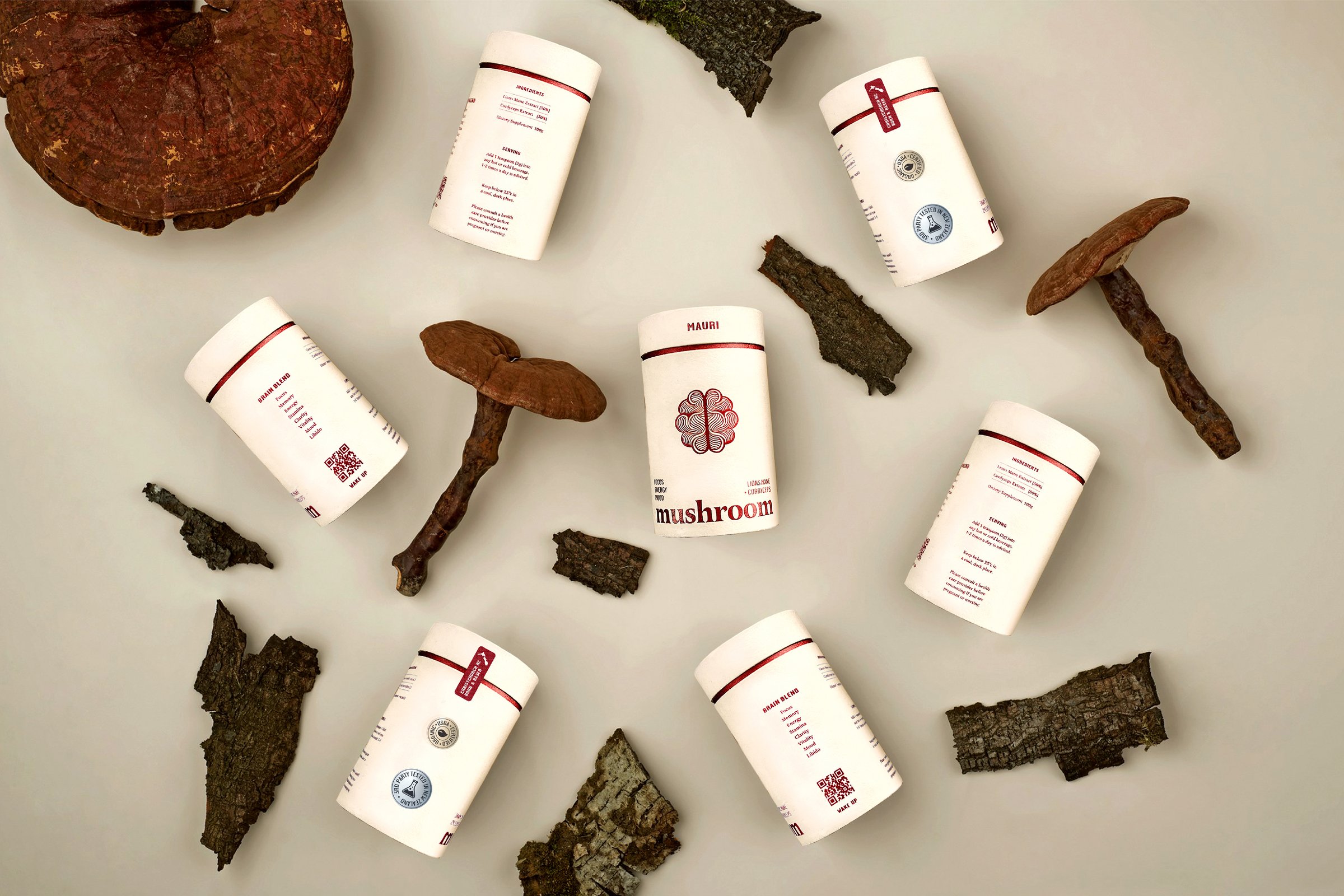
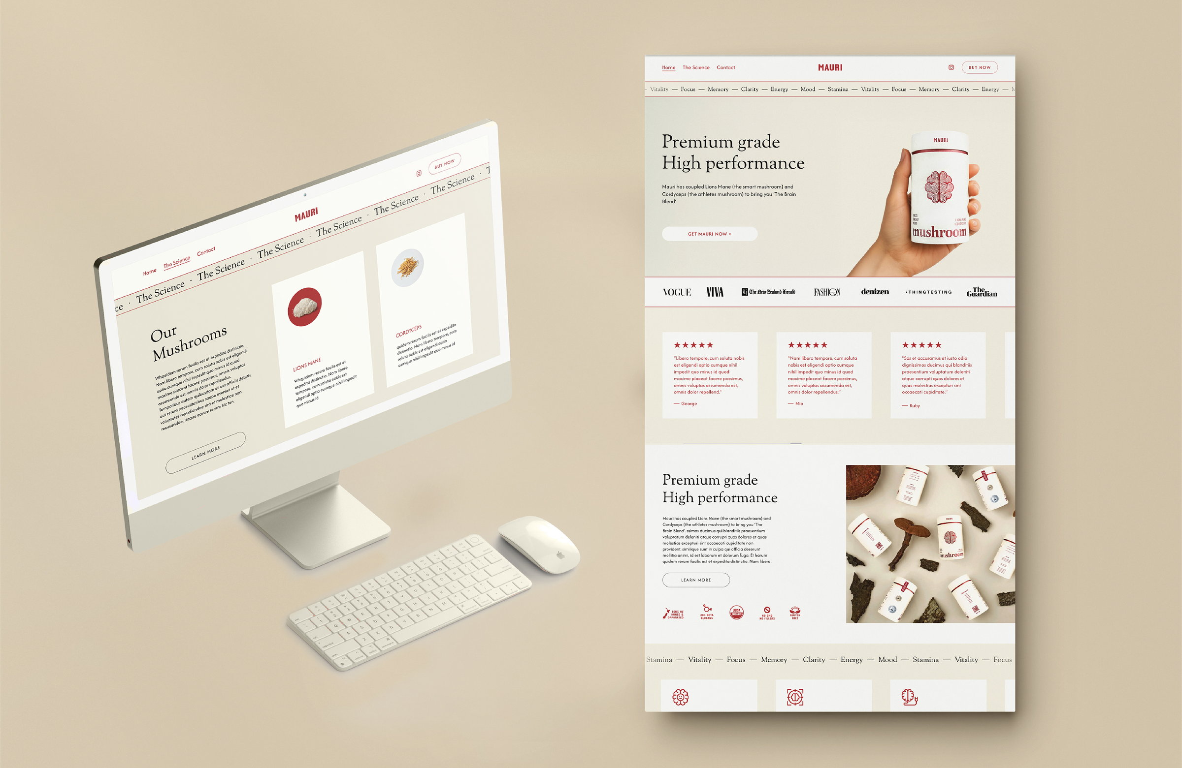
The label, the range photography and the site were drawn together rather than in sequence, which is why they still look like the same brand at every size.
- What was made
- Identity
- Label design
- Art direction
- Web design
- Process
- Dieline
- Label
- Print proof
- Photography
- Motion