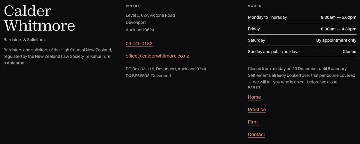
Calder Whitmore
A law firm’s site that answers the question before it is asked.
Legal sites usually open with a handshake photograph. This one opens with the work: five numbered practice areas, each with a plain sentence saying what it actually involves.
Broadsheet proportions, one weight of rule, and no photography at all — the type carries the whole thing.
- What was made
- Art direction
- Web design
- Front-end build
- Built with
- Astro
- Cloudflare Workers
What it does
The wordmark first, the reassurance second
A law firm site usually opens with a handshake photograph. This one opens with the name at full height on near-black, then a single sentence saying what the firm does and where it has done it since 1984. The phone number sits beside the appointment button, because half the people who arrive will ring instead.
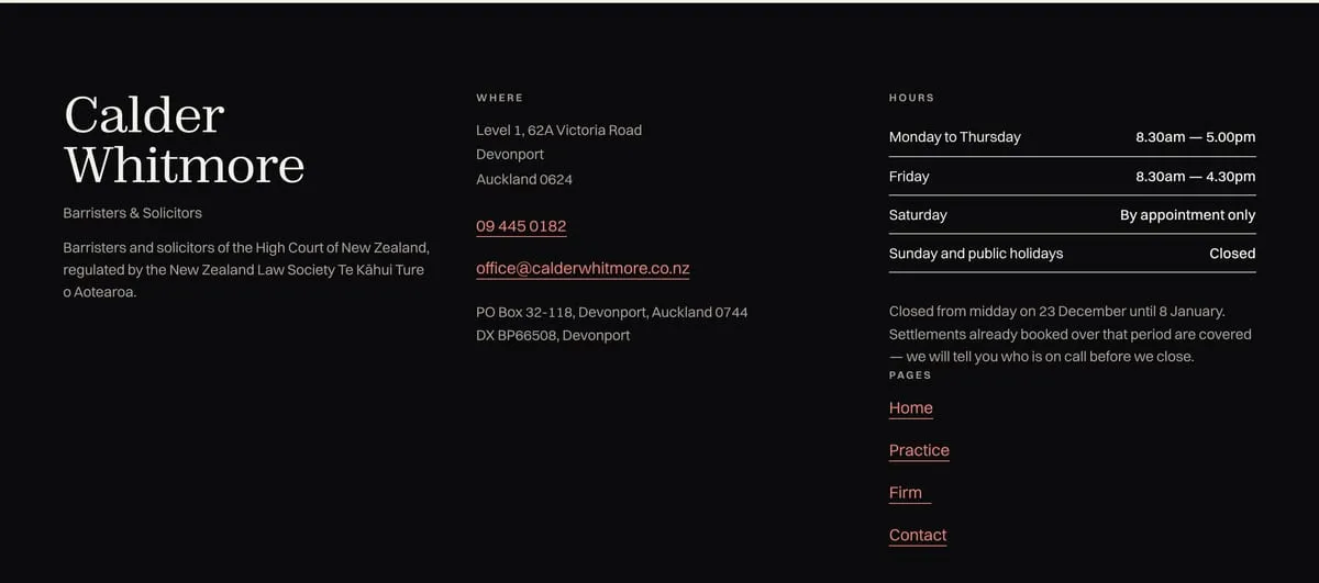
Five practice areas, one sentence each
Property, wills, trusts, relationship property, business. Each carries a plain line that says what it really involves — "the documents that decide things when you cannot" — and expands for the detail. Nobody has to already know the legal word for their problem.
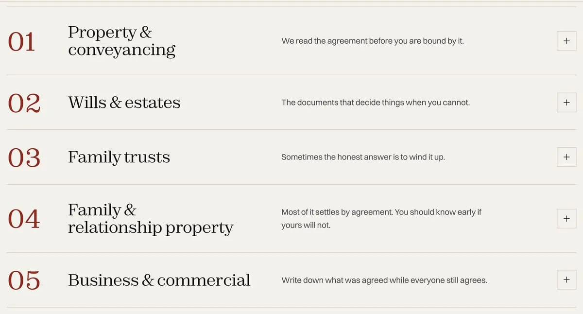
Published fees, with the basis for each
A real table — matter, basis, price excluding GST — for the work the firm is asked for most, with disbursements listed separately and the first half hour not charged. Publishing this is a commercial decision most firms will not make, so the page is built to make it look deliberate.
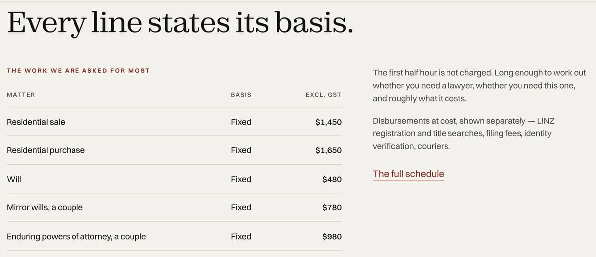
The things a firm is obliged to say, said properly
Regulator, complaints process, physical and DX addresses, hours including the Christmas closure and who is on call through it. Compliance copy usually reads as an afterthought; here it is set with the same care as the headline.